Website Redesign
Client: Clock Tower Bakery
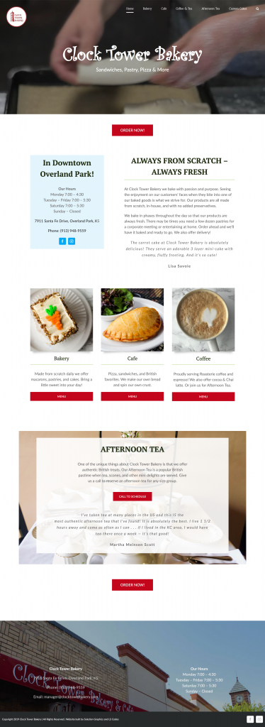
Laurie Waala purchased the Clock Tower Bakery about a year before she contacted me about a redesign of her site. She had made some improvements to her site but it still didn’t reflect her vision of her business. She wanted more photos and a more appealing layout. But mostly she wanted her brand identity to come through. The hero photo on the homepage exemplifies exactly how Laurie feels about her business. It’s about the work. It’s about handcrafting baked goods with impeccable technique. And now her site reflects her vision.

We needed an update to our website. Lisa listened to my thoughts about our business, our current website and things I liked and disliked about other websites. She brought it all together in a great design that was a perfect fit our business
Laurie Waala, Clock Tower Bakery


